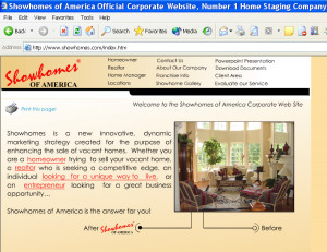
Before: Website circa 1990s
A company with a unique business model came to me for help with their website. Two partners had just purchased the company and were poised to expand franchising operations into more than 400 new markets.
The problem? As the new owners described it, the existing website, which was “state of the art” just a few years before was now out of date. And since they were looking to appeal to an upscale clientele, they not only needed a visual makeover, they needed brand-new copy to speak to their affluent, sophisticated audience.

The old website that talks about their “innovative, dynamic marketing strategy”
While one of their in-house web designers tackled the visual aspect of the site, I took a stack of their marketing materials and began work on the text. The goal: solid benefits-focused copy that spoke to three distinct audiences:
- Real estate professionals who have vacant properties for sale
- Homeowners who need to have their vacant houses staged for quick sale
- Prospective home managers
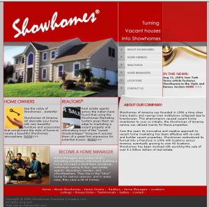
After: New layout, new sales-oriented copy
The most obvious problem with the old copy was that it focused on features (i.e., what the company does), not benefits (i.e., what customers gain). It didn’t speak to the things that concern its readers: the anxiety that homeowners have over leaving a vacant property on the market, the hassles real estate professionals experience trying to sell empty houses, and the desire of prospective home managers for affordable and comfortable temporary housing.

The new site that speaks directly to their 3 customer types
So the “teasers” on the home page start with these needs and how the company meets them. Then the individual pages addressed to these separate audiences expand on those themes. Contrast this with the old home page’s vague opening line about the company’s “innovative, dynamic marketing strategy.”
Lesson: Here it is again – the classic benefits vs. features discussion. Your customers don’t care what you do – they care what you do for them. It’s not an esoteric point. Let them know why you’re the solution to their problems. Don’t leave it to them to figure it out.